
Quantaid
Turning a single-feature quiz app into a full quantum computing learning platform
Overview
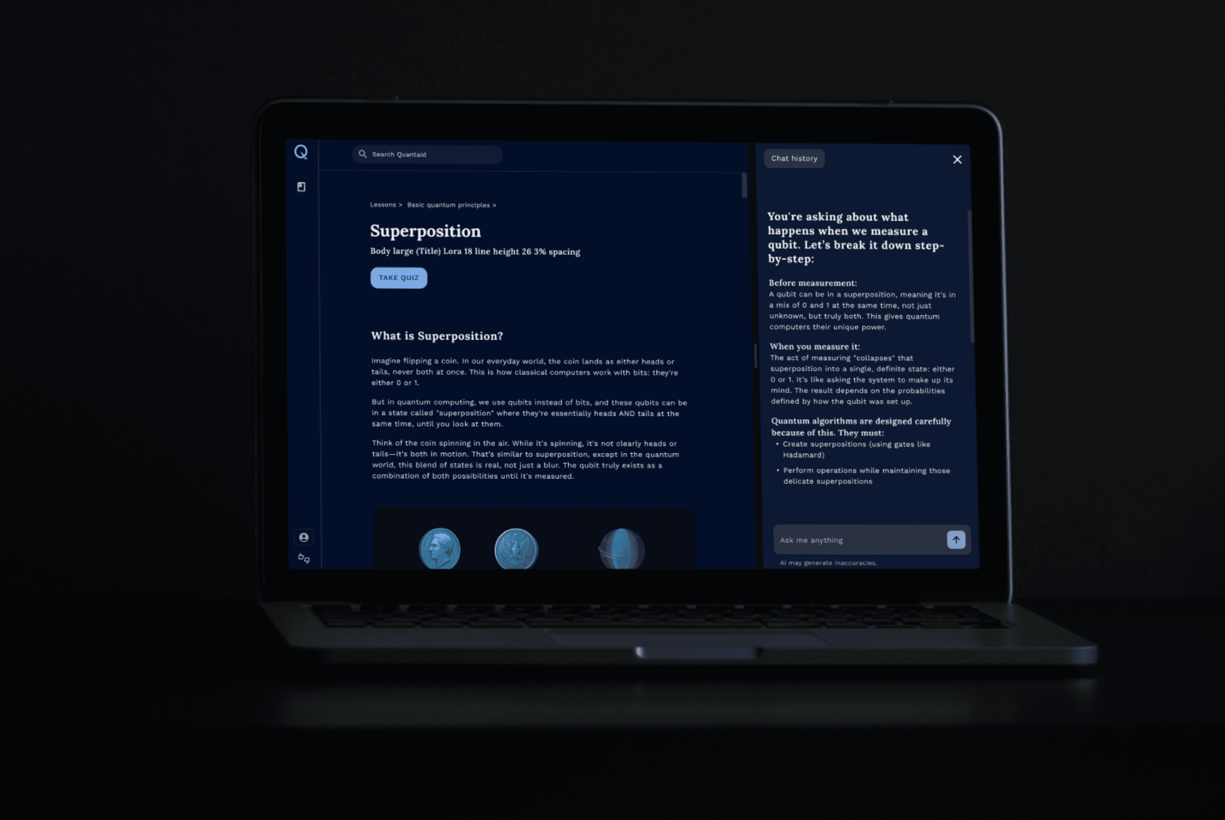
Quantaid is a desktop web app that makes quantum computing learnable via structured lessons, AI support, and knowledge checks in one cohesive experience.
The product started as a quiz app with one core idea: teach quantum computing through hobby based analogies.
I identified that the core assumption wouldn't hold up at scale, made the case for a broader platform, drove the strategic pivot, and owned the architecture and design end-to-end.
Role: Product Designer
Tools: Figma, Figjam
Skills: Research Strategy, Product Thinking, Prototyping, Usability Testing
Team: 2 Developers, 1 Product Designer
2024-2025
Problem
The quantum computing education market has a supply problem: the learners exist, but the right product doesn't.
Limited awareness and accessibility
Quantum computing is complex, expensive and perceived as inaccessible to the average learner.
Knowledge gaps
Learners often have partial understanding in one area but lack the cross-disciplinary knowledge needed to connect concepts effectively.
Early stage development and fragmented resources
The field’s rapidly evolving nature can make educational resources feel scattered or overwhelming.
Outcome
A learning platform that makes quantum computing accessible by providing:
A structured path from zero to competent

AI support that meet learners where they are
One experience, no context switching

Process
I mapped the competitive landscape across learning platforms, AI tutoring tools, and quantum-specific products to understand what already existed and where the gaps were.
Paywalled and academic
The platforms that teach quantum computing well are expensive and dense. They serve researchers, not curious beginners.
Gamified but shallow
Gaming-style platforms create engagement but sacrifice depth. Learners have fun but don't actually build understanding.
No support layer
Most learners end up studying alone, which accelerates drop-off on a subject this abstract.
Since most students were already using LLMs to fill gaps, I studied how AI tools structure explanations to reduce cognitive load. That directly informed the interview questions I designed and the feature direction we built.
User Research & Interviews
I designed user interviews to understand
How beginners approach learning complex topics
What frustrates them
What their learning preferences are
What keeps them motivated
Our participants included computer science students who had already studied quantum computing, as well as CS and high school students who were interested in the subject but had no prior experience.
INTERVIEWS
Cs students, familiar with QC
CS students, unfamiliar with QC
High school students
USABILITY TEST
Since the team had already built an analogy-based quiz, I proposed a usability test to check if the approach actually worked. I added a lessons page to the prototype to compare two scenarios: did users benefit from learning the concept first, or did jumping straight into quizzes work just as well?
What users told us

Knowledge gaps
Learners struggled to connect concepts across math, physics, and computing.
More visual engagement
Users wished there were visuals to make concepts more concrete
Mixed reactions to analogies
When analogies landed, they helped. When they missed, they made learning harder. An approach that works half the time is a product risk.

Jason, 16
High school student · STEM background
"Since quantum computing is a new field, I don't have a lot of resources that really start from the ground up."
GOALS
Gain a foundational understanding of quantum computing
Assess relevance as a potential career path
Learn independently without formal courses or external guidance
PAIN POINTS
Concepts feel abstract and intimidating without visuals
Overwhelmed by scattered resources
Self-learning feels lonely and isolating
NEEDS
Structured learning path from scratch
Jargon-free explanations with visuals
Built-in support so he doesn't have to leave the platform
Novice learners curious about the subject with no idea where to start

Jasmine, 22
Undergrad CS student · Minor in math
"I'm still learning the fundamentals, so without a background in linear algebra, jumping into complex topics is harder."
GOALS
Assumed prior knowledge creates frustration and gaps
Beginner content feels too basic, advanced too dense
Knowledge gaps force constant external searching
PAIN POINTS
Assumed prior knowledge creates frustration and gaps
Beginner content feels too basic, advanced too dense
Knowledge gaps force constant external searching
NEEDS
A learning path bridging beginner and in-depth research
Regularly updated content reflecting latest QC developments
Practical exercises to cement skills
Advanced learners with basic QC knowledge seeking to go deeper
These showed that it was important to not only generate interest in quantum computing but figure out a way to sustain it as well.
The research strengthened my push for a more complete learning experience and align the team to reposition analogies as a nice-to-have aid instead of the core teaching mechanism.
The team wasn't ready to let go of the analogy-first approach yet. so I explored ways to make analogies more reliable. If they could land consistently, the approach might still hold up.
As we explored how to make analogies more reliable, I used that space to design supporting elements around core user needs, ensuring the product still moved forward even while the analogy approach was under evaluation.
Rethinking Analogies
There were two analogy types to consider:
Academic analogies
Standard explanations already used in textbooks. Consistent but impersonal.
Hobby-based analogies
Personalized to the learner. Helpful when they landed, confusing when they missed.
The challenge was that hobby analogies often failed to explain the concept clearly and sometimes made it more confusing.
To address this, I proposed an approach where the AI would first assess which type of analogy would be clearer in a given moment, and then serve either a general academic analogy or a personalized one.

Decision flow showing how the right analogy type is selected based on the learner's context.
Where we landed
As I explored ways to make analogies more reliable, the team concluded the analogy-first approach wasn't the right foundation.
We ultimately adopted an "Analogize" button placed alongside "Explain," giving learners the option to request an analogy only when they wanted one.
Explain
Analogize
Sitemap
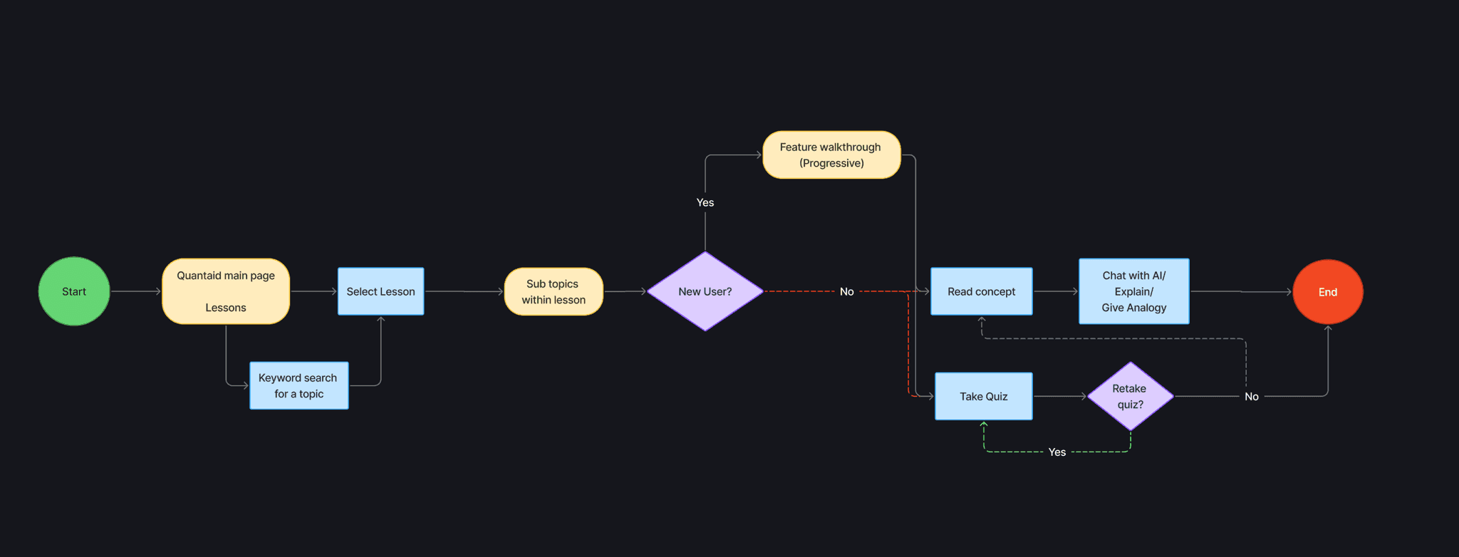
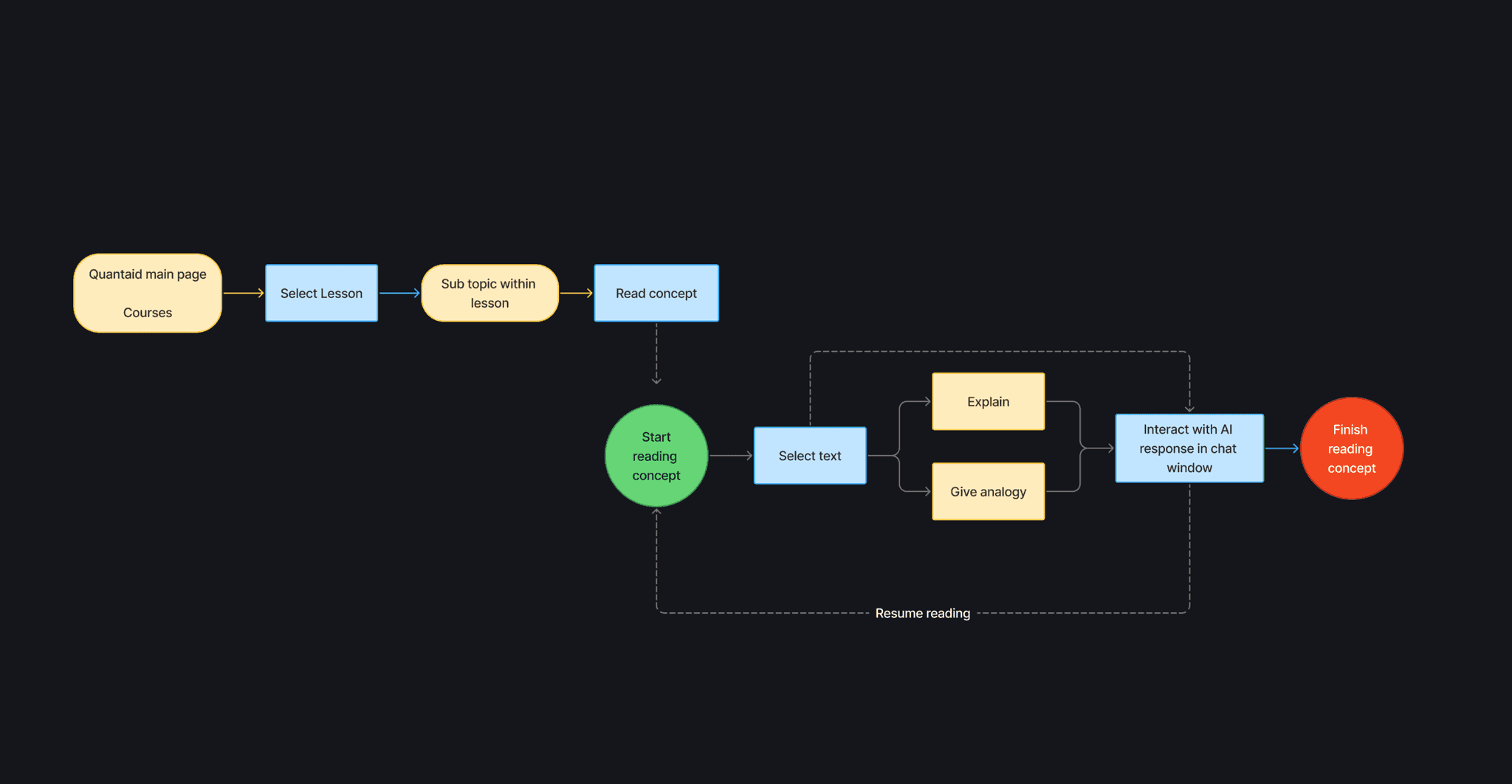
With the Direction set, I mapped out every task a learner would need to complete and built a sitemap to define how the content should be organized.

Decision flow showing how the right analogy type is selected based on the learner's context.
User flows
With the content structure in place, I moved on to designing user flows for the four core journeys: onboarding and personalization, reviewing concepts, turning to AI when stuck, and testing their understanding through quizzes.


Once I had more clarity, I expanded the initial framework into more structured wireframes and interaction flows. Given the relative simplicity of the core screens, structure and UI evolved in parallel through ongoing internal feedback.
At the same time, I started exploring the visual direction of the platform. Early on, I toyed with the idea of introducing a mascot named Kelvin, inspired by the quantum refrigerator, as a way to add curiosity and approachability.
As the structure and interactions took shape, it became clear that a more mature visual language better supported credibility and long-form learning. This led me to move away from the mascot concept and toward cleaner, more focused visual decisions.
Before


After


Visual identity
The visual direction was built to support learning first and scale as the platform grows.
Logo
The logo's Q traces the path of a qubit, tying the mark directly to what the product teaches.
Typography
Lora + work sans
Header 1
Header 2
Body large
Body text
Small caption
Why?
I reviewed how learning platforms handle long-form reading across dark and light modes before settling on a type pairing. Lora for headings creates clear hierarchy
Work Sans for body content keeps extended reading sessions comfortable.
Color Palette
82AEF1
3B89FF
AAAAC1
E1E5ED
030E29
121C36
263047
All key brand colors meet WCAG AA contrast standards on dark backgrounds
Buttons
Primary
WCAG AA Pass

Button
Secondary
WCAG AA Pass
Button
Tertiary
WCAG AA Pass
Button
Users wanted more engaging visuals, and given the futuristic nature of quantum computing, I leaned into dark mode and deep blue tones to evoke technology and innovation.
Input from students also reinforced a strong preference for dark mode when studying.
Usability test
I conducted a usability test to evaluate visual clarity and to ensure users were able to navigate through the tasks intuitively. It uncovered important details I had missed, helping me refine the flow and make the overall experience feel smoother and more intuitive.
What worked
Visuals were engaging and the AI support was appreciated by users.
Analogies were seen as useful but optional, validating the repositioning.
The quiz flow was clear and easy to complete.
Iterations

I designed a progressive discovery pattern to introduce the highlight-to-explain and analogize feature in context, letting users encounter it naturally as they moved through the platform.
During development the team opted for an upfront walkthrough instead. Testing showed that nearly 50% of users skipped it, which led to confusion and difficulty discovering the highlight feature later on.
I raised this with the team and pushed for the contextual approach. The team kept the walkthrough due to development constraints, but the drop-off rate made a strong case for revisiting it after launch.

Added another category for users outside academia
Next steps
WHERE WE ARE
Quantaid is awaiting approval for deployment at a local high school and community college. While we wait, we are already back in discovery.
WHAT CHANGED
The AI landscape shifted faster than anticipated. Students can now build personalized learning tools using agentic AI systems. That changes the question from "does Quantaid work?" to "why would a student choose Quantaid over a custom GPT?"
WHAT WE ARE EXPLORING
The next phase is figuring out what Quantaid offers that a generic AI tutor cannot. Right now we are exploring what that differentiation looks like and what it means for the product direction.
Reflection
This project taught me to trust the design process and embrace iteration instead of overthinking early decisions. Working with engineering product decisions live and die in the space between design and development.
AI tools became part of my workflow throughout, speeding up synthesis, helping me explore edge cases faster, and prototyping interactions I could put in front of developers sooner.
More than technical execution, this work required strong advocacy for users. I learned to slow the team down when scope expanded too quickly, guide discussions back to research-backed insights, and defend simplicity and clarity when complexity threatened the learning experience.
At the same time, I learned to push back with data while leaving room for collaboration, strengthening my confidence in owning product strategy and communicating design reasoning clearly.
